
jQuer.in

The Toolbox

Animation, Bookmarklets, Colors, CSS, Date & Time, Editors, Grids, Icons, Images, Javascript, Lorem Ipsum, Markup, Math, Misc, Patterns, Photoshop, Reference, Regular Expressions, Responsive Design, Search, Sprites, Starter Kits, Typography, Unicode, Web Performance.
A Book Apart

Web design is about multi-disciplinary mastery and laser focus, and that’s the thinking behind our brief books for people who make websites. We cover the emerging and essential topics in web design and development with style, clarity, and, above all, brevity—because working designer-developers can’t afford to waste time.
A Book Apart publishes highly detailed and meticulously edited examinations of single topics. We produce brief books of about 100 pages—the perfect size in terms of subject depth and coverage for topics like HTML5, CSS3, content strategy, responsive web design, and more.
The goal of every title in our catalog is to shed clear light on a tricky subject, and do it fast, so you can get back to work. Thank you for supporting our mission to provide professionals with the tools they need to move the web forward. Let us know what you think about our books.
The Responsinator

Responsive Plugin

responsivepx

Enter the url to your site - local or online: both work - and use the controls to adjust the width and height of your viewport to find exact breakpoint widths in pixels. Then use that information in your media queries to create a responsive design.
Media Queries

What is Media Queries?
Media Queries is a W3C Candidate Recommendation—a widely reviewed document which is ready for implementation by browser vendors.
It's an extension of media dependent stylesheets tailored for different media types (i.e. screen and print) found in CSS2.
In its essence a media query consists of a media type and an expression to check for certain conditions of a particular media feature. The most commonly used media feature is width.
By restricting CSS rules to a certain width of the device displaying a web page, one can tailor the page's representation to devices (i.e. smartphones, tablets, netbooks, and desktops) with varying screen resolution.
What is Responsive Web Design?
The term Responsive Web Design was coined by Ethan Marcotte and is the practice of using fluid grids, flexible images, and media queries to progressively enhance a web page for different viewing contexts.
What screen resolutions do you use while taking screenshots?
Smartphone
320px
Tablet
768px
Netbook
1024px
Desktop
1600px
Responsive News

HTML5 Please
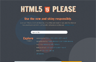
Look up HTML5, CSS3, etc features, know if they are ready for use, and if so find out how you should use them – with polyfills, fallbacks or as they are.


Hello Everyone!!!
Welcome To assadotcom.blogspot.com. Thanks For Your Visit. assadotcom.blogspot.com is The Ultimate All In One Homepage And Web Information, Offering an Innovative Visual Exploration Of The Internet.
Regard,
assadotcom
assadotcom Philosophy

Someone is a Doctor, Someone is a Teacher, Someone is an Engineer, Someone is a Mentor, Someone is a Cracker, Someone is a Hacker, AND I AM AN assadotcom. Just Patch It "N Enjoy!!!


